
Advanced Laser Institute
A brand for a medical-aesthetics practice — clinical credibility with the polish of a premium destination. The word "institute" was the brief: it promises expertise, so the identity had to look considered, established, and quietly expensive.
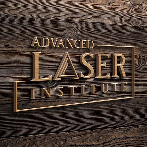
Primary mark — bronze on dark walnut, presented as a dimensional sign.
Sell trust and luxury in one mark.
Medical aesthetics lives on a knife's edge: patients want results from someone clinical and credible — but they're buying a premium, personal experience, not a procedure.
Lean too clinical and the brand feels cold; lean too "spa" and it loses authority. Most competitors pick one and miss the other. Advanced Laser Institute needed a mark that did both at once — precise enough to trust with your skin, refined enough to feel like a destination.
Precision, set in a frame.
The mark hides a focused beam in plain sight — a sharp triangle forms the "A" at the heart of LASER, a quiet nod to precision and light. A clean rule frames the lockup like a plaque, giving it the composure of an established institution, not a pop-up clinic.
Rendered in bronze on deep walnut, it reads warm and premium — gold without the flash. The frame and the triangle are the two assets the whole system is built from: drop them onto a wall sign, a treatment-room door, or a foil-stamped card and the brand still feels like itself.
Bronze, not flash. Warm, not cold.
Letter-spaced & composed.
A complete identity — owned outright. Bronze, walnut and a frame that holds the brand together from a wall sign to a foil-stamped card.
- Primary logo + icon & wordmark lockups
- Full-color, all-gold & 1-color versions
- Vector source — AI · EPS · PDF
- Web-ready PNG (transparent) + JPG
- RGB + CMYK for screen & print
- Brand quick-guide — colour, type, usage