
Zenith
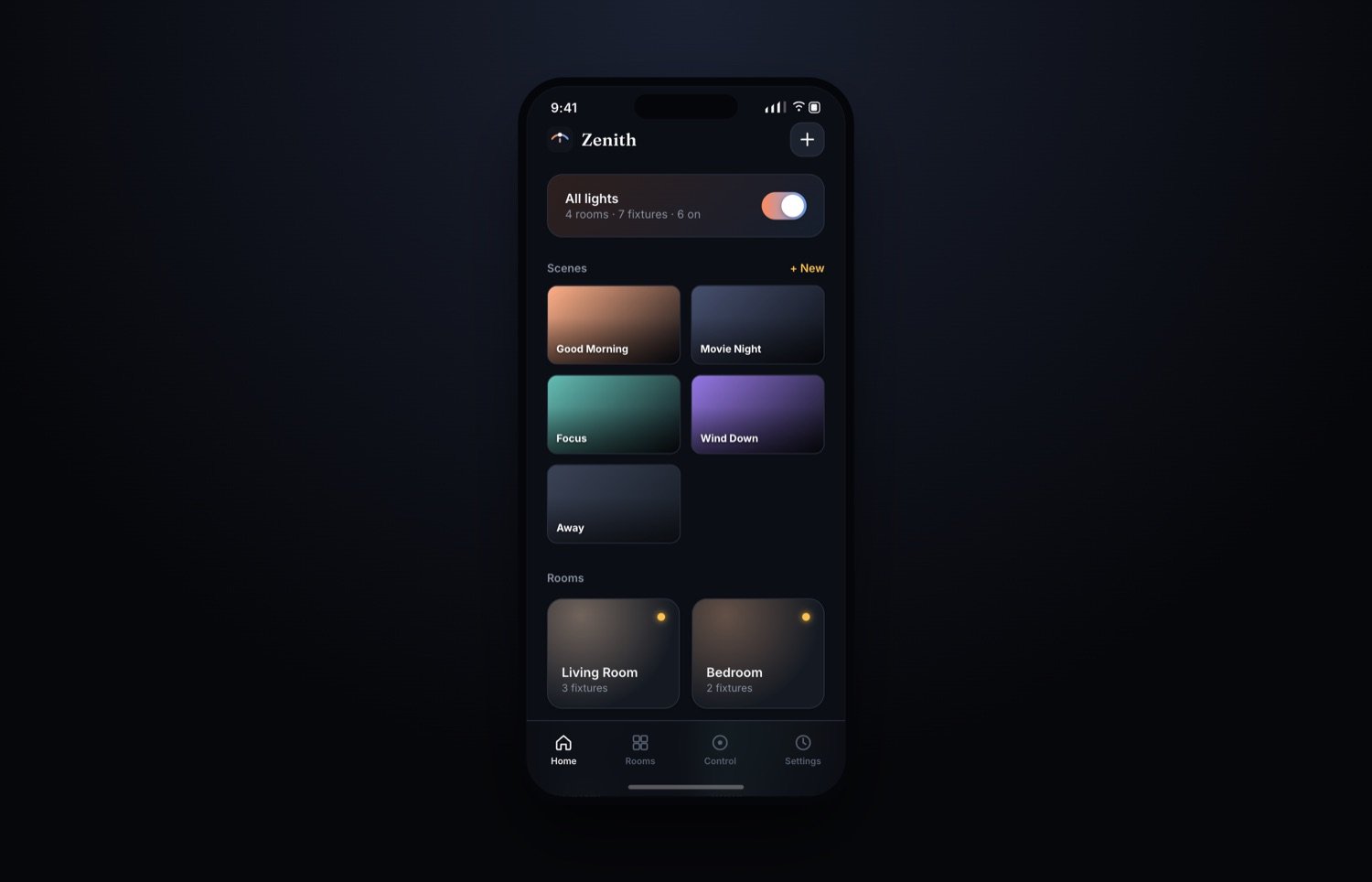
A smart-lighting control app — scenes, rooms and fixtures on one clean surface. Shipped, then honestly re-audited against a rival redesign: the icons weren't clear enough, the slider fill fought its own value, and selection states were invisible until after the tap. Fixed all three.
Smart-home apps fail on the small stuff.
Color-only indicators that don't read for anyone with a color-vision deficiency. Sliders where the numeric value sits directly on top of a fill that changes color as you drag — unreadable exactly when you need it most. A "you can select this" affordance that only appears after you've already picked something, not before.
Zenith's first pass had all three. A rival AI-generated "redesign" claimed to fix them — worth reacting to honestly, separating the real, adoptable ideas from pure concept art that couldn't actually run.
Fixed the affordances, kept the calm.
Icons replaced bare color dots throughout. Slider fills got a contrast pass so the value stays legible at every position. Selection now shows an always-visible ring before you pick, not just a highlight after. Scenes and rooms model stayed — the fixes are structural, not decorative.
Icons over dots
Every control now carries a shape, not just a color — legible without relying on hue alone.
Readable slider fills
Contrast fixed so the value sits clear of the variable-color fill behind it.
Always-visible selection
A selection ring you can see before you pick — not just after.
Scenes & rooms
Good Morning, Movie Night, Focus, Wind Down — presets that stay one tap away.
A calmer, more legible control surface — and a repeatable audit method for evaluating any AI-generated "redesign" honestly, separating real interaction-design ideas from concept art that can't actually run.